So you are probably wondering… Why is the “resident wordsmith” writing about design?
Before committing and even as I was helping build HM’s design system, I wasn’t sure what value I would bring to this endeavour. But what I have come to realize is that my contribution is less on the design aspect – it’s more on building the system and developing a common visual language that my team can use to realize the solutions they are building.
What is a Design System?
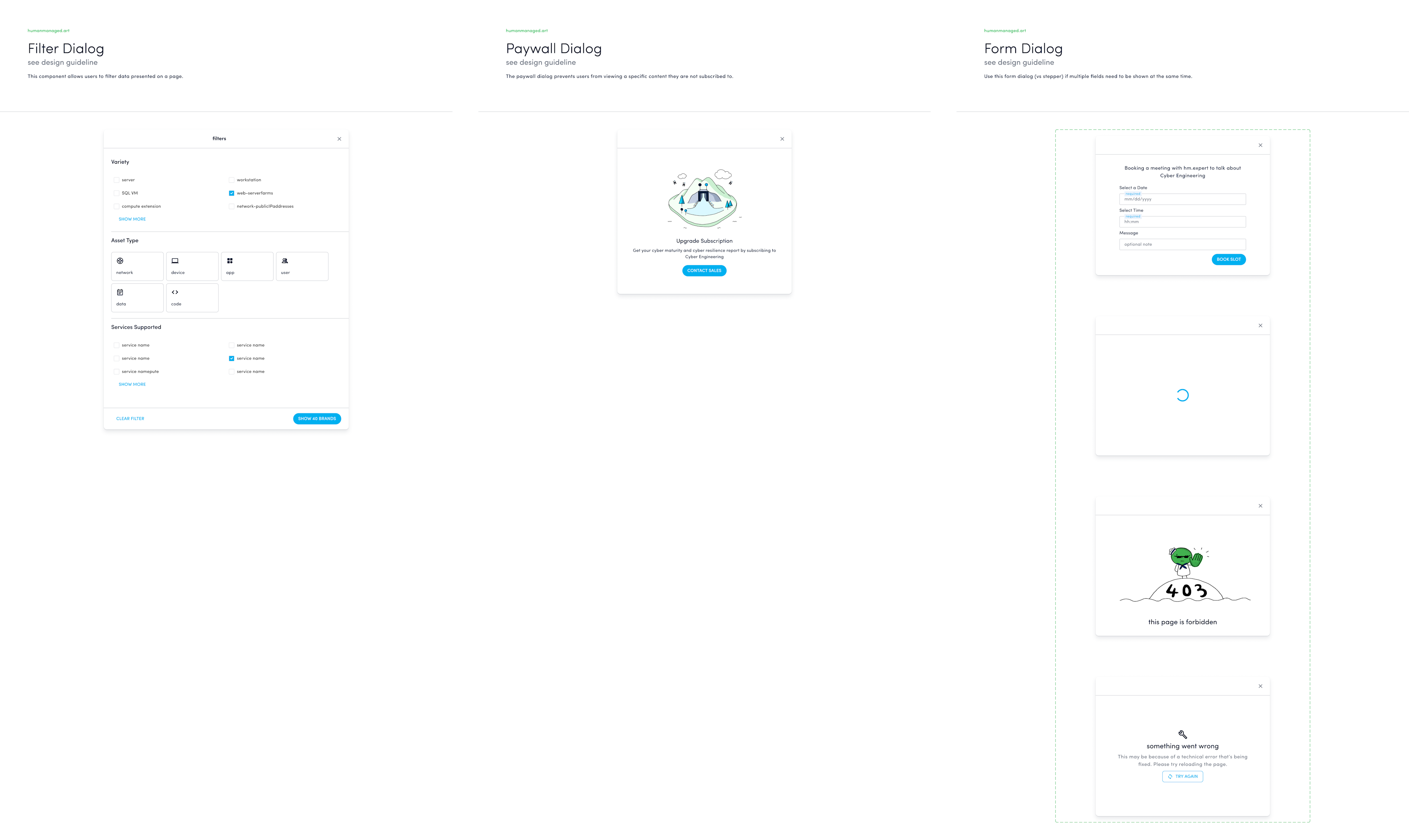
Imagine a library; but instead of books, you see components such as buttons, input text boxes, table cells, just to name a few. The design system is your organization’s repository for pre-built components and patterns -- the building blocks needed to create consistent digital experiences, faster.
Why we needed a Design System
Human Managed is a data platform that generates intelligence, recommends decisions, and tracks actions. Given that our customers from various industries build cyber, digital, and risk use cases from their own unique data, the product needed to be designed in such a way that customers can consume reports and subscribe to notifications and dispatch from a web app.
Needless to say, our services are different for every organization (and can be different per persona) means that our services cannot be hard-coded or monolithic in any way.
In the beginning, we knew that a modular approach to design was the goal, but we didn't know exactly how to achieve this. When I initially got involved in product design, we already had an established brand guideline, and so we designed screens while ensuring that we followed the brand colors and templates. Systematic, somewhat, but I soon learned that that was an illusion.
We were able to ship the first few screens, but things got really hairy when the volume and the pace of internal and external requests and changes increased. We learned the hard way that none of the components that made up the initial pages could be reused, because they were hard coded. Every change was essentially a new design, when it didn't have to be.
We knew we needed to do better.
A better way to build
To work through the challenge we were experiencing, our team did the following to get started with our Design System:
We worked within a framework.
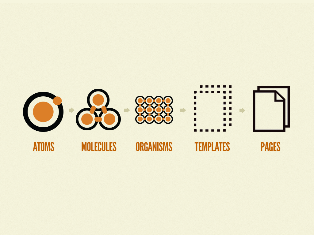
We asked stakeholders to read Brad Frost’s seminal work, Atomic Design. This methodology brought logic and structure to the way we worked. Initially, we had difficulty communicating why it was taking a while to push a page to production. Now, everyone understands that development takes more time when a molecule or organism hasn’t been designed and/or coded yet.
Adopting this methodology was a no brainer as well as it followed the principle of modularity; one of our guiding principles in building the hm.works platform.
We examined how others built their library.
We shortlisted Design Systems that caught our eye and analyzed how they organized theirs. Thankfully, there are organizations who have open-sourced their Design Systems, sharing the specs of the components and patterns they have built. These were shared on the web and also via Figma – a platform that has been extremely pivotal to our team. We purchased Figma solely for UI, but it has proven to be more than that, especially due to the Community it has built. We rarely found ourselves creating components from scratch because someone in the world has already built something similar.
But of course, just like anything that you get from open sources needs to be integrated into your systems. It was no different for us: we still had to tweak existing component designs so the end result is a cohesive experience of our brand.
If you’re looking for inspiration, here are a few design systems we looked at: Carbon (IBM), Atlassian, Helsinki Design System, Polaris (Shopify), and of course Material Design (Google).
We audited our designs.
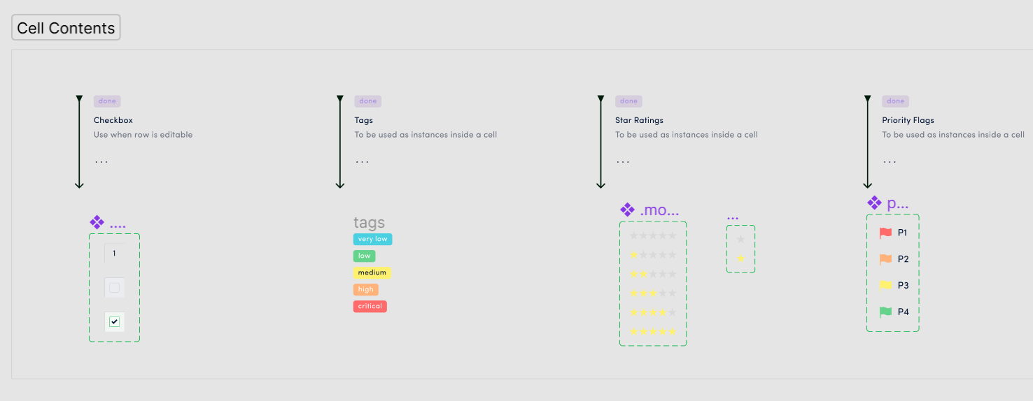
We printed out the pages we had in production and broke them down into atoms, molecules, and organisms in order to make them reusable. During our audit, we realized that we weren’t using colors consistently. Strictly implementing design tokens is probably a different blog post altogether. But clearly, we had to refine our selection. We went for a top-down approach and selected the most used colors in our existing designs, defined them as styles and published it in our team library.
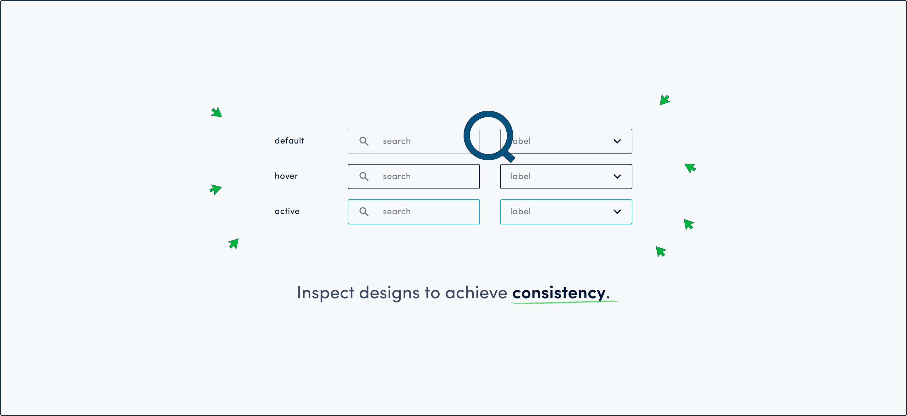
Comparing our design against other design specs also allowed us to define the states, variants, and properties of our components. In this step, we asked a lot of “what ifs” and thinking about our core product concepts so we can account for all possible permutations each component would be used.
Lessons Learned
As with any endeavour, it was impossible to go about this without any debts and thoughts of how we could have done things differently.
Documentation
You wouldn’t know the importance of documenting until a component is misused, or the design is not implemented properly. Currently, we have documented design specifications and component anatomy necessary for a design hand over to our codemanaged function and the gig community. However, I still daydream about going on a month-long “vacation” to enhance documentation necessary to open source our Design System.
Better Visibility
We figured out a bit later the importance of having an inventory of your components after they have been coded. For this job, we have deployed Storybook. We have just begun incorporating this into our workflow so I look forward to that day when I can use it as a playground and marvel at our component inventory.
Needless to say, the Design System has been built but will never be done. As our product grows, our design system evolves as well.
Looking back at this herculean task, we experienced the pain of discarding and redesigning old designs and creating new ones. But without a doubt, going through these definitely allowed me and our team to grow as a member of the Present stack.